Frax Finance
Description
—Context I reached out to the founder of Frax, Sam Kamezian, on Twitter to inquire about an app redesign, after having difficulty using it myself. —Problem Frax’s app was bloated, with major data overload on top of confusing UX. Important features were hard to use and hierarchy was nonexistent. —Goal A comprehensive redesign: reduce the cognitive overload, consolidate navigation, improve usability, implement a new design system, create a view for the new FPI feature.
Client
Frax Finance
Year
2022
Type
App Redesign
DISCOVERY
Frax's founder Sam and I met to discuss the scope of the project. We locked in process, timelines, check-in cadences, and resources. These were important early conversations to understand both his goals and the workflow we'd use.
Insight
Frax is proud of how much data is available to users
Desire for app to be "softer and visually appealing"
Only one dev available for building the FE, who also had other responsibilities to balance
Maintain some previous architecture so learned behaviors weren't lost completely

We aligned around a standard iterative process, with the distinction of concurrent design system work and paper wireframing—allowing us to maintain speed and hit our internal timeframe.
RESEARCH
Frax's founder is incredibly active in his community, as well as a power user, and I leaned on his insight for existing feedback about the app's shortcomings. This was then combined with a heuristic analysis to create actionable steps.
Users experienced significant "time sink" trying to complete tasks
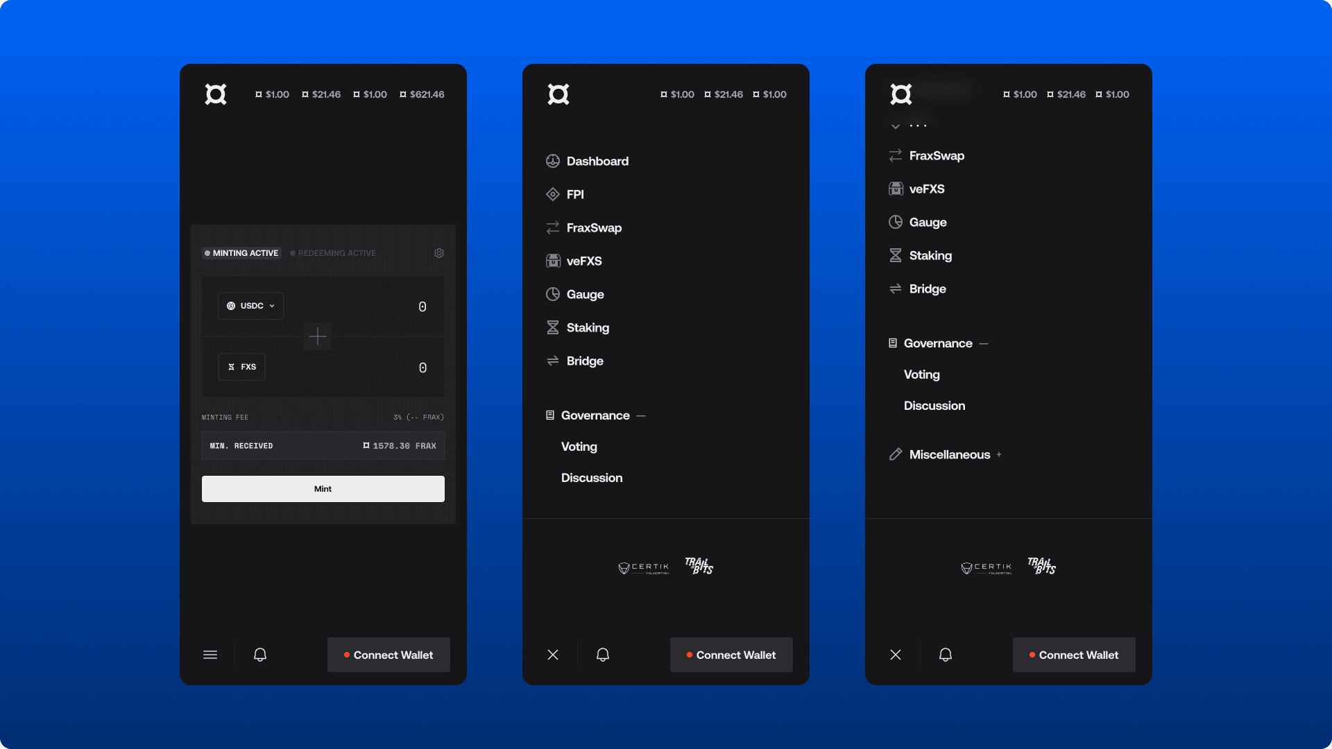
Clean up usability issues in core features, leverage common web3 patterns (token swaps, staking) to inject existing external user behaviors
Create common layouts and a stricter set of components for consistency across all views
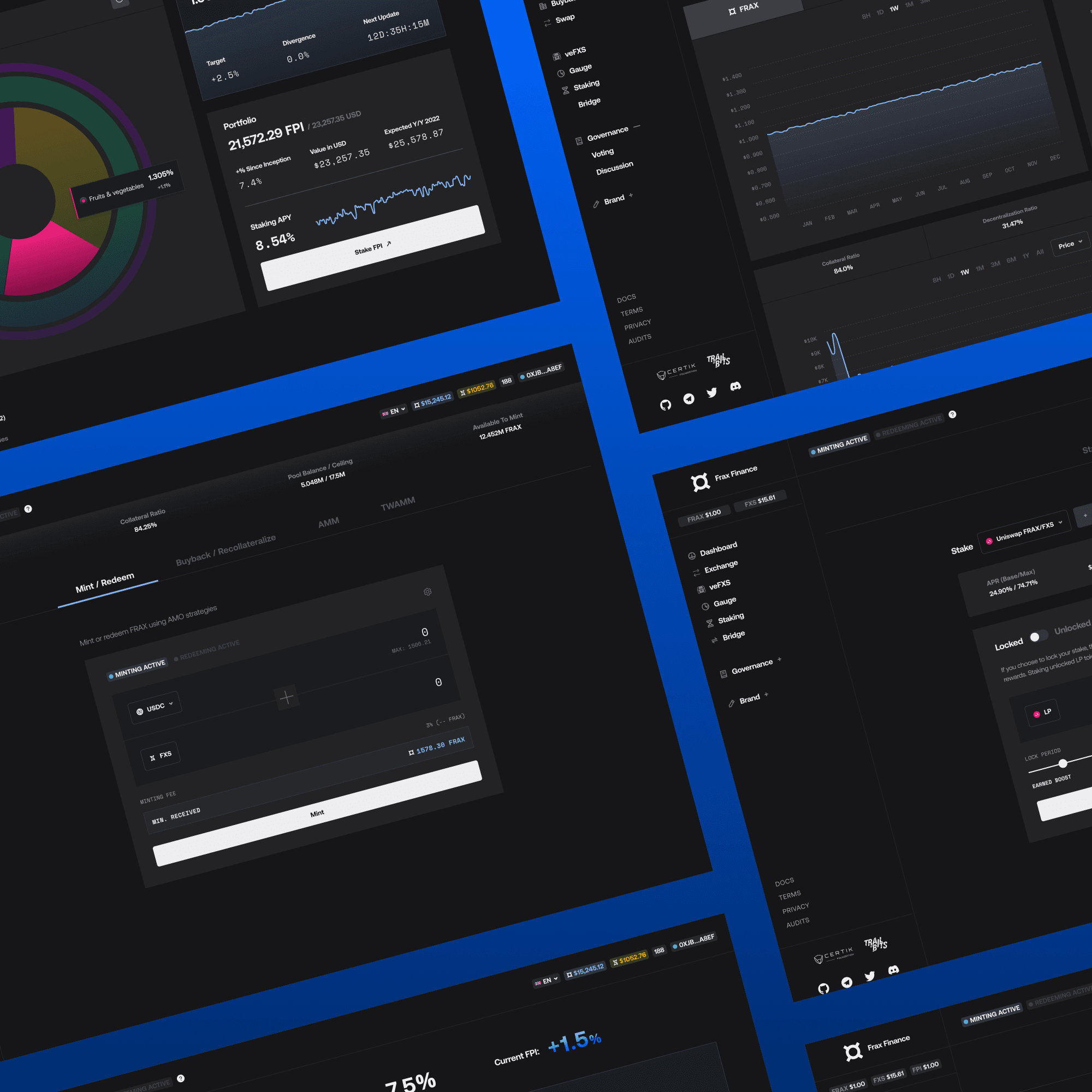
Frax is complex. Users got lost looking for features or were overwhelmed by density. Mechanisms that borrow the same functionality, like swaps, were split across several separate views
Recommendation
Improve navigation to minimize nested contexts and overload while improving feature discoverability
Consolidate views where possible to group by feature type so similar functions are accessible in the same place
Reduce unnecessary information inside of each context
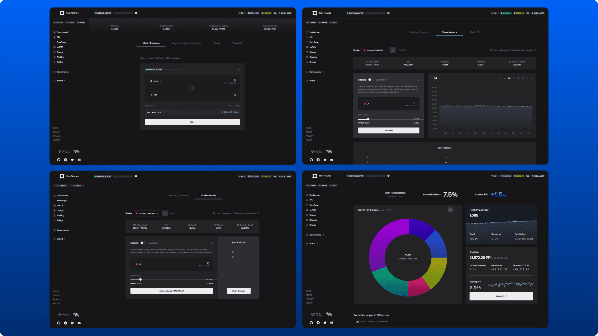
DESIGN
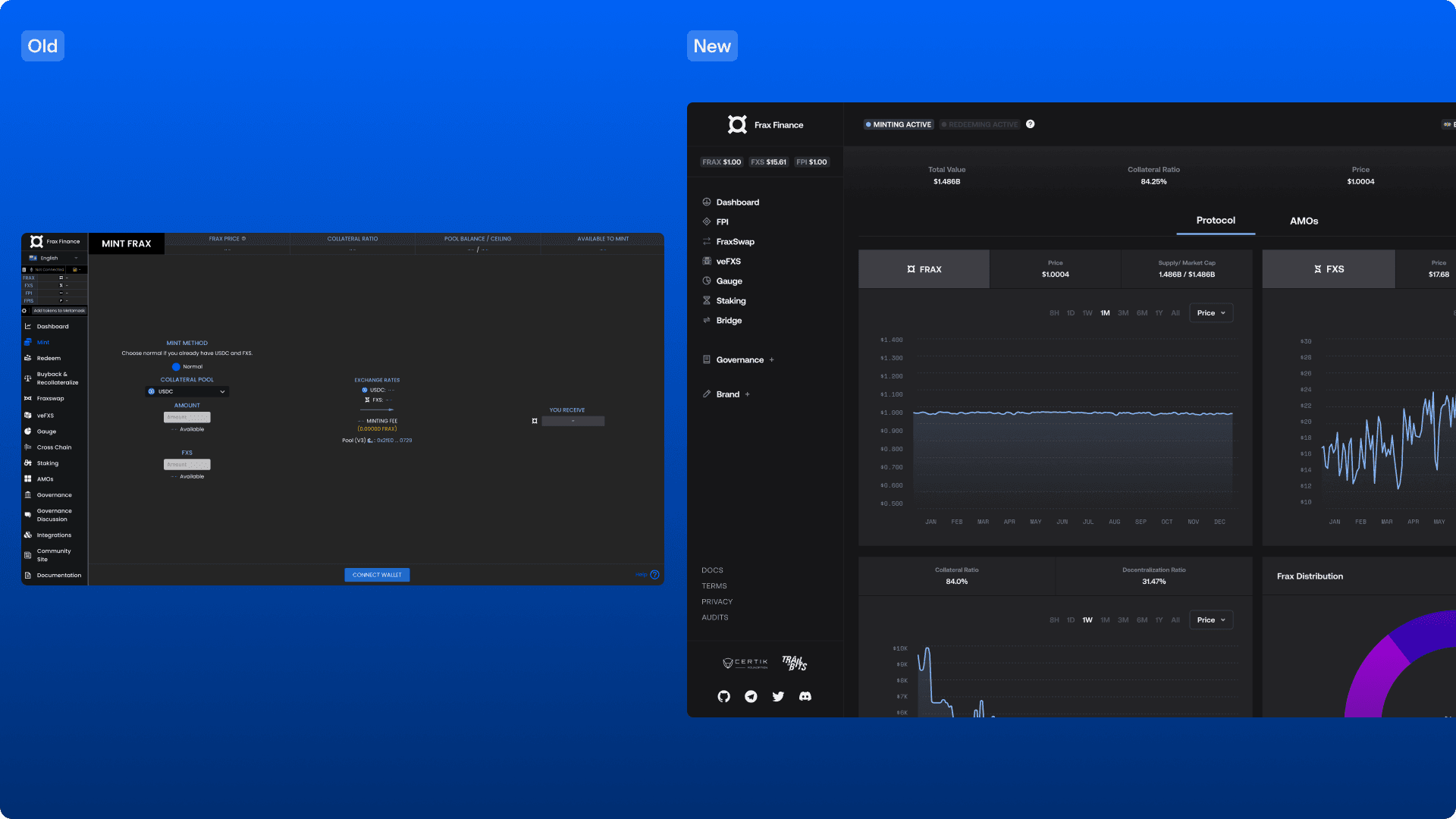
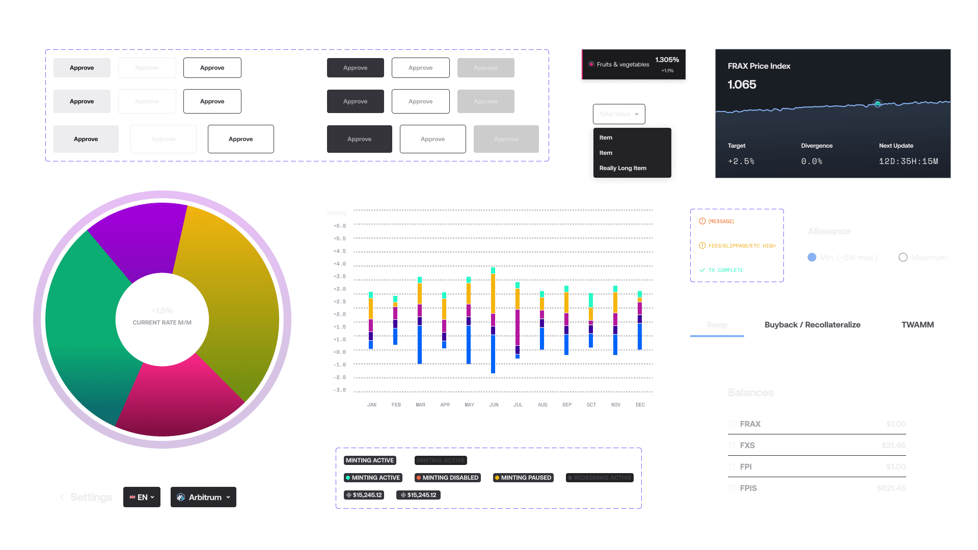
A design system was created while initial screens and patterns were mapped on paper. Radix components and Visx libraries were chosen as a foundation to reduce dev overhead. Weekly check-ins were had for progress updates, tradeoff discussions, and team feedback.

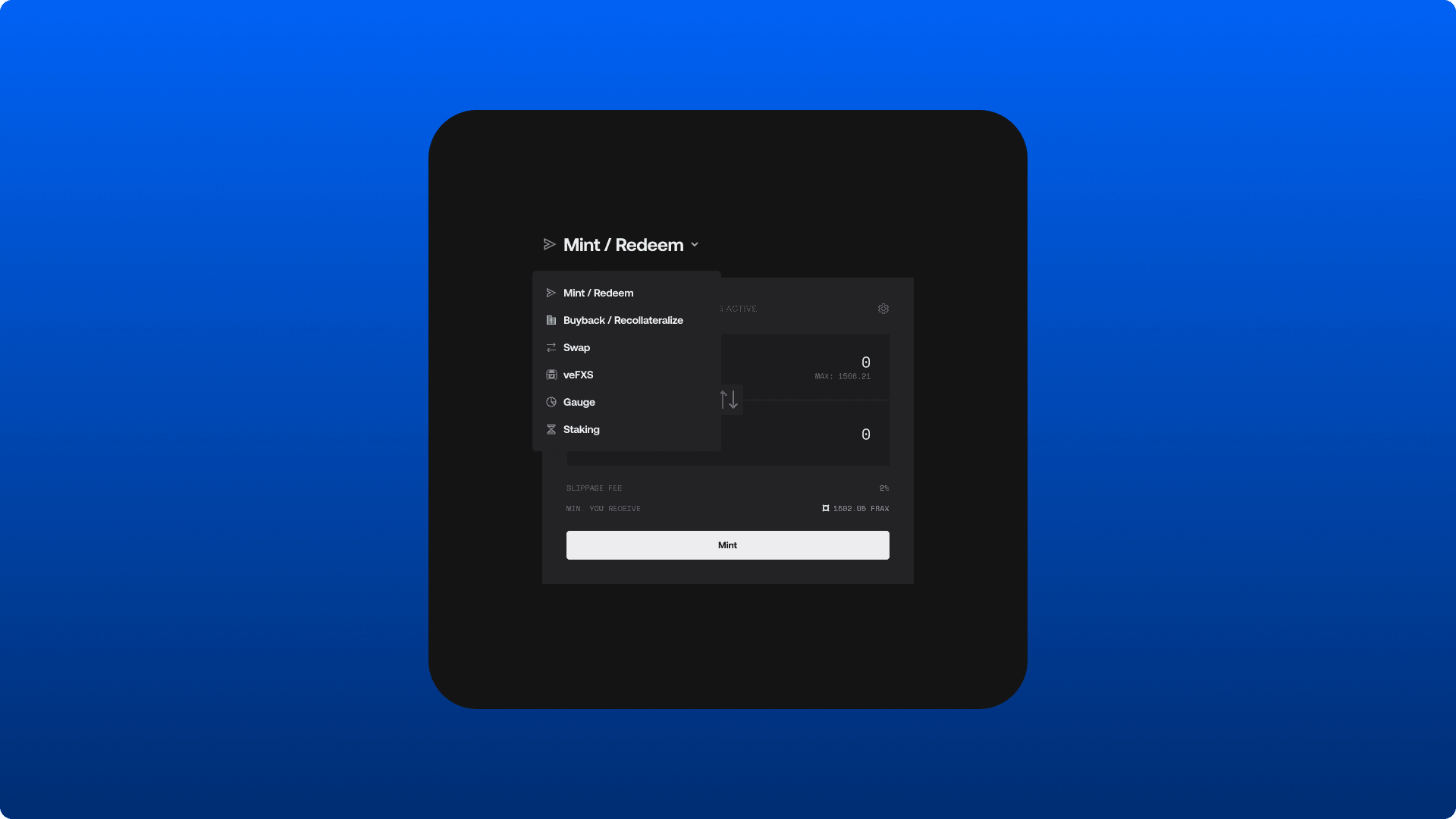
Extensive conversations were had to understand core mechanisms such as minting and recollateralization, with learnings then applied at a component level in the design system. One example: we were able to automate functions depending on a user's selected input token, resulting in a massive reduction in manual selections required.
DESIGN
The first high-fidelity designs were started, locking in key layout decisions that could simultaneously be handed to dev while being iterated to include feedback from regular syncs.
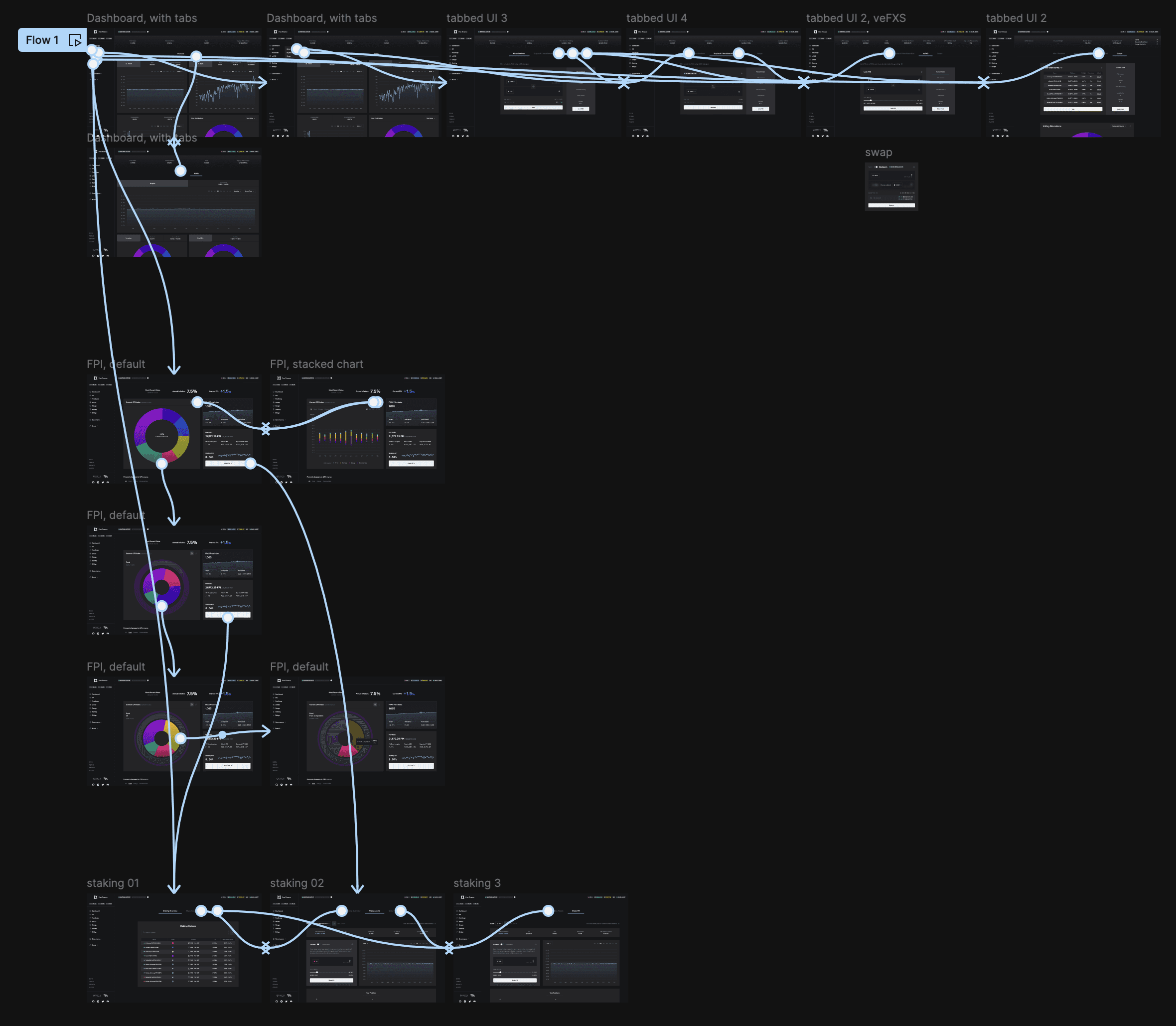
TESTING
Prototypes were simultaneously created to pass amongst the Frax team, allowing us to validate the new navigation structure, component interactions, and fluidity of use.
OUTCOMES
Some later designs eventually ran out-of-scope, and dev responsibilities meant windows to sync were narrow.
Full handoff meant not being able to measure metrics after delivery
Learnings
Keep tight stakeholder communication when dealing with complex features.
Prioritizing patterns expedited high-fidelity mockups
Wins
Positive team feedback.
A thorough design system and consideration for key patterns /layouts means Frax is able to extend the designs without my input